

The Core Idea
Sheer color keeps returning because it solves a familiar beauty and fashion problem: how to look fresh and expressive without committing to a heavy, highly defined style. Transparent washes of pink, peach, lavender, blue, or brown can change the mood of an outfit or makeup look while preserving the texture underneath. They add color without completely covering the skin, fabric, or features that make the look feel personal.
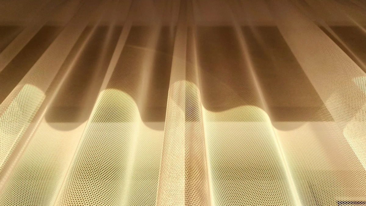
That balance is the reason the sheer color trend appears again and again. It is not simply a preference for pale shades or translucent materials. The larger idea is controlled visibility: color is present, but softened. In makeup, this might mean a glossy stain instead of an opaque lipstick, a watercolor blush instead of a strongly sculpted cheek, or a veil of tinted shimmer on the eyelids. In fashion, it can appear through translucent layers, lightweight knits, organza, mesh, or fabrics that let an underlying color influence the final result.
For readers, this matters because sheer color is often easier to adapt than a more intense trend. You do not need to replace your wardrobe or build an elaborate beauty routine to try it. A tinted balm, a softly pigmented nail color, or a transparent layer over a simple outfit can create the effect with relatively little risk. The same piece can also look different depending on what sits beneath it, making sheer color more versatile than its delicate appearance suggests.
The challenge is that transparency can be less predictable than solid color. A shade may look subtle in its packaging but become brighter on the skin. A sheer garment may appear refined on a display rack but feel impractical when layered incorrectly. Lighting, texture, undertone, and the color underneath all affect the result. Understanding those variables helps you distinguish between a wearable update and a look that feels accidental.
The central takeaway is not that every sheer item is worth buying. It is that translucent color offers a flexible way to experiment with change. It can make familiar products and basic clothing feel current while keeping the overall effect light, layered, and individual. Once you view it as a method rather than a single seasonal aesthetic, you can decide where it belongs in your routine—and where a more opaque, structured choice will serve you better.
What to Look For
When deciding whether a translucent color will work for you, start by observing how much coverage the product or material provides. Sheer does not always mean barely visible. A tinted balm may leave a soft veil of color, while a buildable cream blush can become noticeably brighter after two or three layers. In clothing, a lightweight organza blouse may be transparent only in certain light, whereas a mesh skirt may show more of the underlying garment. Check the level of visibility before judging the shade itself.
Next, compare the undertone. Pink, peach, lavender, blue, and brown can all appear flattering or unbalanced depending on whether they lean warm, cool, or neutral. A peach lip tint may enliven warm or golden undertones, while a berry wash can create more contrast against cool or olive coloring. The same principle applies to fashion: an icy blue sheer top may look crisp with silver accessories but disconnected beside warm tan and rust tones. Testing the color near your face, rather than relying only on an online swatch, gives a more accurate impression.
Pay attention to what remains visible underneath. The appeal of transparent color depends on the base showing through in a pleasing way. On skin, natural freckles, texture, or an existing blush can add dimension. On fabric, a tonal camisole or matching slip can make transparency look intentional, while a strongly contrasting layer creates a bolder effect. Ask whether the underlying color supports the result or competes with it.
Another useful signal is how the color changes in different lighting. Glossy makeup may look subtle indoors but more saturated in daylight. A sheer dress can appear elegant under soft evening light and much more revealing near a window. View the item in natural light, warm artificial light, and photographs before making a decision. This is especially important when shopping online, where screen brightness can distort both transparency and intensity.
Finally, consider the amount of contrast in the rest of the look. A translucent lavender wash can be the focal point when paired with clean skin and neutral clothing. The same shade may feel busy with glitter, strong contour, and multiple bright accessories. Look for balance rather than matching every element exactly. These signals explain why the sheer color trend works across beauty and fashion: it is adaptable, but its success depends on coverage, undertone, layering, lighting, and contrast—not on the color name alone.
A Practical Approach
The easiest way to wear translucent color is to treat it as a gradual styling decision rather than an all-at-once transformation. This keeps the result intentional and gives you room to adjust as you go.
1. Start with one low-commitment piece. Choose an item that can be applied or removed easily, such as a tinted lip balm, cream blush, sheer nail color, lightweight scarf, or translucent blouse layered over a camisole. Beginning with one piece helps you understand how the color behaves against your skin, hair, wardrobe, and usual makeup. It also prevents the look from feeling overly coordinated before you know whether you enjoy it.
2. Decide how visible you want the color to be. Use a single layer for a quiet wash, then build gradually if the product or fabric allows it. The sheer color trend works best when you control the intensity instead of assuming that transparency must mean maximum delicacy. For makeup, apply a small amount at the center of the lips or the highest point of the cheeks, then blend outward. For clothing, try the transparent piece over a similar-toned base if you want a streamlined effect, or over a contrasting layer if you want the color to stand out.
3. Pair it with a stable neutral. A neutral anchor makes translucent shades easier to judge. Black, white, cream, denim, gray, and brown can all provide a visual frame without competing with the color. If the sheer piece is pale or cool, a soft neutral often keeps it from looking harsh. If it is warm or saturated, a darker neutral can give the outfit definition. In beauty, use a simple eye look or a natural lip when experimenting with a noticeable wash on the cheeks.
4. Check the result in different settings. Natural daylight, indoor lighting, and photographs can reveal very different levels of color and transparency. Look at the result from a normal distance, not only in a mirror close to your face. This matters especially for fabrics, since movement and backlighting may make a garment more revealing than it appeared while standing still.
5. Add only one stronger element at a time. Once the first piece feels comfortable, increase either the saturation, the amount of coverage, or the number of translucent elements—but not all three together. A brighter lip tint can work with a neutral outfit; a more transparent top may need a simpler color palette. This measured approach keeps the effect fresh and wearable rather than accidental.
Common Mistakes to Avoid
One common mistake is assuming that sheer color means barely noticeable color. Translucent fabrics and beauty products may look delicate in the package, yet appear much stronger once they meet natural skin, light, or a contrasting layer. This can make a carefully planned outfit or makeup look feel unexpectedly intense. Before committing, check the item in daylight and against the clothing or skin area where it will actually be used. A color that seems subtle under a store’s bright lighting may read much bolder outdoors.
Another error is choosing a shade based only on its popularity. The sheer color trend often brings attention to fashionable tones such as milky pink, washed blue, soft green, and translucent brown, but a trending shade is not automatically the most flattering or useful one for you. Color temperature, undertone, and contrast still matter. If a shade makes your complexion look dull or clashes with your existing wardrobe, test a nearby variation rather than forcing the exact runway color. For example, a cool lavender may be easier to wear as a muted mauve, while a bright orange can become more versatile as a warm peach.
It is also easy to confuse coordination with repetition. Wearing the same translucent color on the eyes, lips, nails, clothing, and accessories can make the result look overly deliberate. Sheer color usually works best when there is some variation in texture or intensity. If the clothing is the main statement, keep the beauty elements quieter; if the makeup carries the color, let the outfit provide contrast or visual space.
Do not overlook what sits underneath or behind the sheer element. A transparent blouse, mesh shoe, or tinted gloss can change dramatically depending on the base layer, skin tone, or surrounding colors. Check the full combination rather than judging each item separately. Try the piece with two or three realistic outfits, and take a photograph from a normal distance. The camera often reveals whether the color looks balanced or disappears into the background.
Finally, avoid treating maintenance and occasion as minor details. Sheer fabrics can wrinkle, snag, cling, or reveal more than expected, while glossy products may migrate during a long day. Test movement, comfort, and wear time before choosing the look for work, travel, heat, or an important event. A trend becomes genuinely useful when it survives real life—not merely when it looks appealing for a few minutes in a fitting room.